Did you know that 76% of the customers make decisions while in the store?
That’s why store layouts are crucial to your business. With the rising effect of digital, more customers come to the store with research, and the layout of your retail store is even more critical to make sure they find what they are looking for.
A good store layout welcomes the customers when you can’t, and it paves the way for more sales. If you can adapt your store to your customers’ shopping habits, designing the perfect retail store layout can increase your sales and keep those customers coming back as loyals.
Related: Everything You Need to Know About People Counting
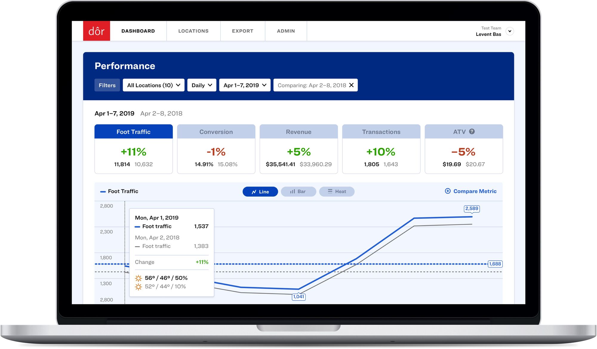
Did you know that a 1% increase in your store’s conversion rate can mean a 10% increase in revenue?
Click here to discover how Dor can help you understand your foot traffic data and make more profitable business decisions.
Ready to purchase? Complete your purchase in just minutes!
1. Pick the right retail store design
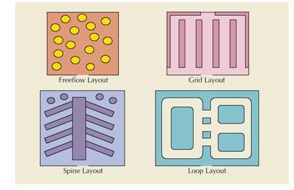
There are various types of store design retailers use. They are carefully planned according to the:
- Size of your store
- How much inventory you keep at store level
- The essence of what you sell
It's all to make sure the customers are "guided" and not "wandering" inside the store, so they'll leave you profit bucks as they leave the checkout cashier.
Here are the essential retail store design types to give you some inspiration.
The Basic: Grid Store Layout
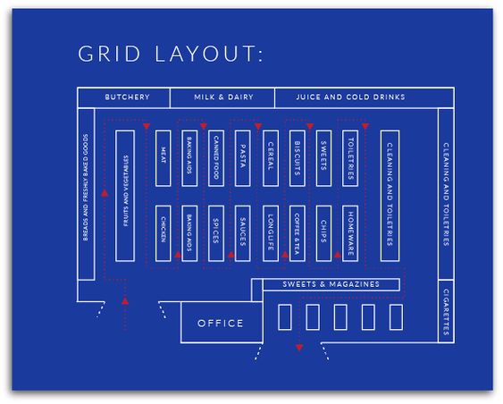
A grid layout is basically used to maximize every corner and wall at your store.
Think of a typical Apple store, and you’ll visualize what a grid layout is. It makes you showcase your products in a way that makes your customers familiar with the exact location so they know where they are headed.
It also makes the aisles more useful because both sides of the store run have products to offer. This type of retail store plan is also less expensive in terms of store furniture.
On the other side, when moving along with this layout, you have to make sure that all the space is used in a way that doesn’t feel too crowded or too empty. There needs to be a balanced approach to the actual number of products on display.
Racetrack AKA Loop Layout
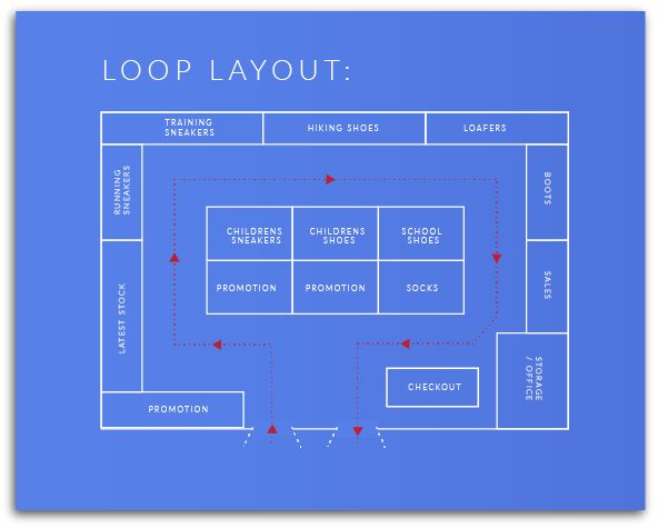
Racetrack or the loop retail store layout creates a continuous flow for the customers, so they end up where they began inside the store.
This type of layout is specifically preferred by stores that have smaller space to show the products.
The loop layout allows you to give maximum efficiency to your store while looping the customers in. It gives you more access to influence the customer to your brand story, and of course, you should make sure to end the story with the happy ending known as the cashier.
Related: 13 Irresistible Checkout Counter Ideas to Increase Retail Sales
Geometric or Free Flow Layout
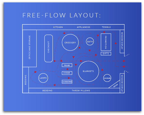
Geometric/free flow layout is the most creative or hip retail store layout you can think of.
There are no rules or structures with this type, so you can unleash your creativity and treat your store as an artist’s gallery. This type of retail layout can be used, especially if you have a younger customer demographic, and your products also match the layout.
Think of a Uniqlo store. They use geometric layout in some parts of their store, reflecting the actual products they are selling. A Uniqlo store is like an art gallery or a toy store when selling special collection items.
Diagonal Layout
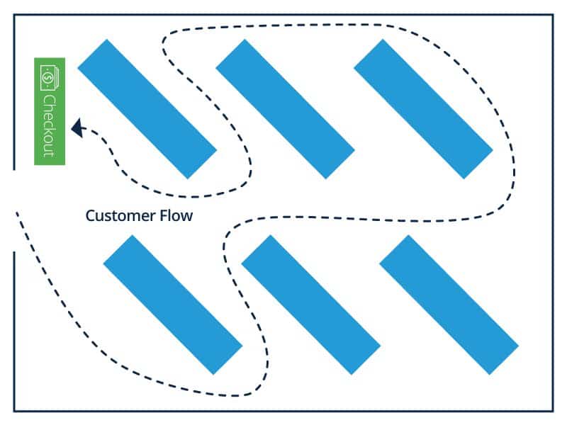
A diagonal layout is actually a grid layout with a slight “twist.”
It’s recommended for the retailers with a smaller space. That twisted or herringbone structured layout will give you more space within the store, so you can still make use of as much space as possible while not blocking the aisles.
“IKEA” Layout: Forced Path
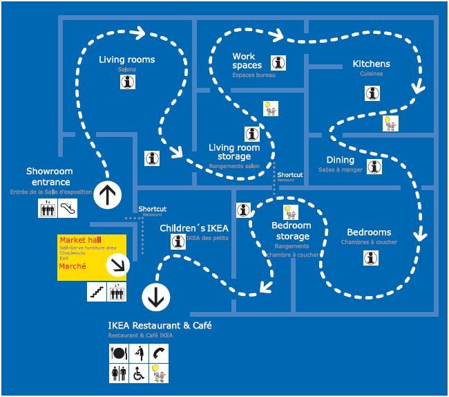
The layout type is clear by the giant retailer mentioned in the name.
The IKEA layout is the type where you draw a “forced path” for the customer, leading the way you have designed for them. Using this type allows the retailer to place the items on the path of the customer, and it is an excellent way for upselling.
As the IKEA customer completes her living room purchase, she jumps into the kitchen section because the kitchen is always next to the living room in a typical house. Just try to imagine your customer’s purchasing patterns and “force the way” in reminiscing of that.
Once you decide which type of retail design you’d like to adapt, the rest is to understand your customer’s experience and basic rules of consumer psychology.
Related: 12 Real-Life Tips for Successful Retail Upselling and Cross-selling
2. Place the product in the "right" way
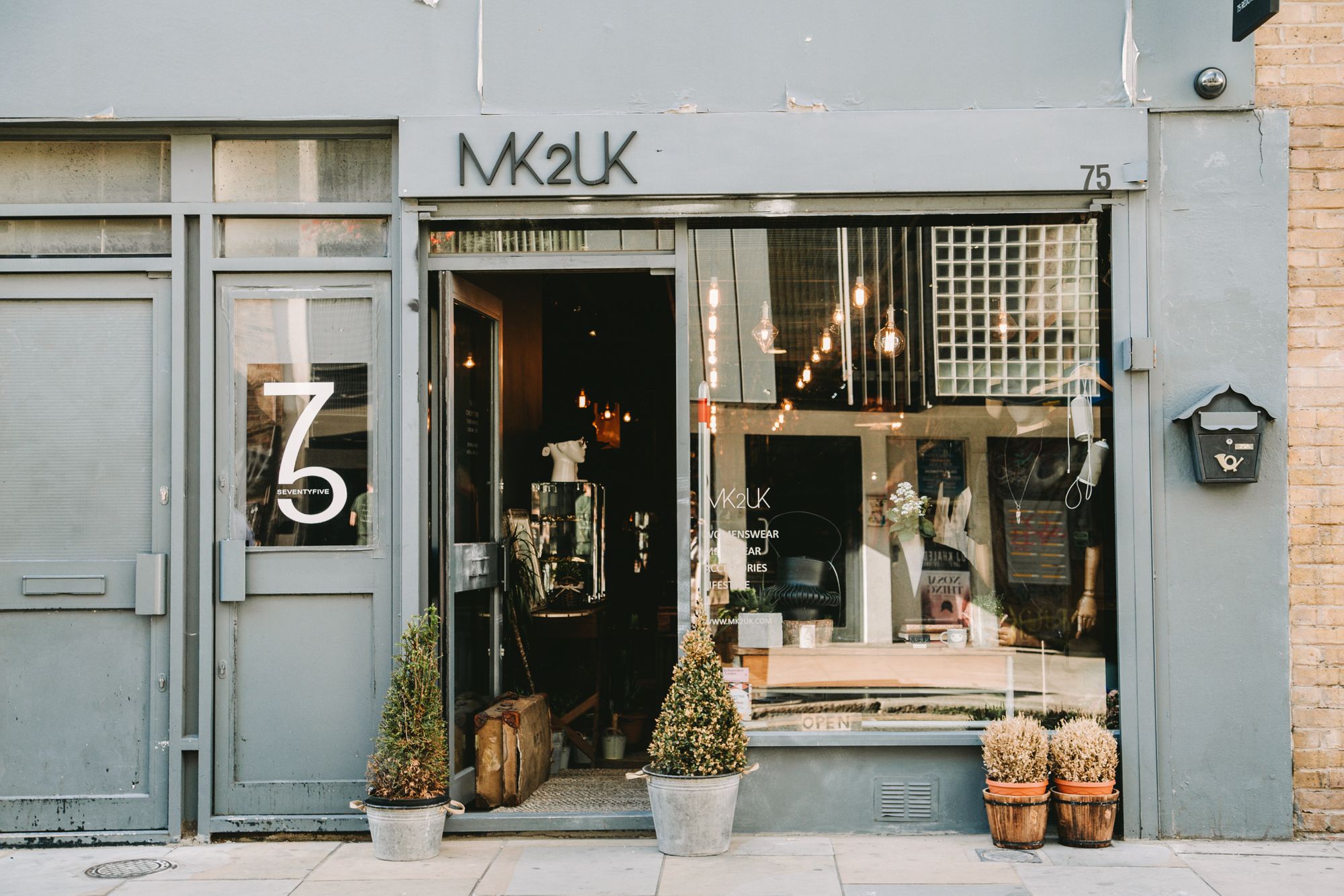
The “invariant right” concept claims that most people automatically turn right when they walk into a store. Some say it relates to the side most people drive at. No matter the reason, if you observe some of the stores in big shopping malls, you’ll see that the right window display of the first clutter of products on the right is always more attractive than the others.
This is your “pull to the store” location. Always try to use bright colors and new arrivals on this side. The juicier it gets, the more customers will be attracted to come in.
Related: 40 Ideas to Boost Retail Foot Traffic and Increase Sales
3. Pay attention to “focal points”
There is a hierarchy of store shelves inside your retail store.
The items you want more engagement with should be displayed at eye level with bright colors to draw immediate attention. Focal points are the initial gateway to products.
This goes the same way for your “smaller” target group as well. If you’re a retailer selling baby toys/products, try to put these items on a lower shelf so the toddlers can find them and take them to their parents for purchase.
Related: How to Increase Positive Customer Reviews for Your Retail Store
4. Use color psychology in the store
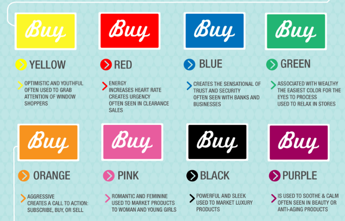
Take advantage of color psychology and adapt them to your displays. Generally, in psychology, red means excitement, urgency, and attention which translates to sales & impulse buying in retail.
Blue is the universal sign of trustworthiness and reliability; so, it’s the most popular color for corporate branding and tells your customers that your products are trusted.
On the other hand, black is a mysterious color. The most surprising deals are offered in black, which makes Black Friday so thriving in most countries.
You can blend your products with these colors and find the right match for your business.
Related: 12 Proven Ideas to Increase Dwell Time of Customers and Boost Sales
5. Hop in a few at checkout
Your satisfied customer is walking through the cashier. It’s important to greet them with a warm smile and a good backdrop. Place a few items on the back shelves at your cashier that they can buy without adding many bucks to their invoice.
These products are best to be items high in profit but low in price for you to benefit the most from these last-minute items. The same applies to your online store as well.
When the customer sees additional products at the checkout page, their likeliness of purchase increases.
Related: 15 In-Store Promotion Tactics to Increase Retail Sales
6. Experience with experiential marketing
"Sales is when you call the customer, marketing is when customers call you," they say.
Experiential marketing is what lies in between. Using your store layout, give your customers something to experience. Do not focus your store layout solely on making huge sales. Give your customers a scent of your identity, a spatial unit for them to try free samples, some music to enhance their experience.
The more time they spend in the store, the more they realize about your products and offerings even though they are not right in front of them. The psychology behind this type of layout is that people tend to match these things in their minds.
Good music, good lighting, good store manager lead to good bucks.
7. Make sure where your SALE shows
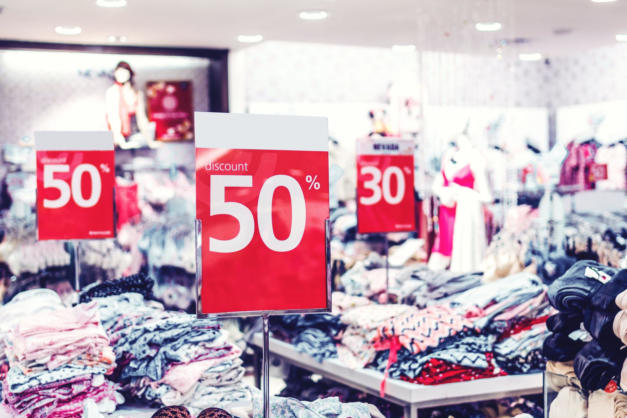
When the "sale" period begins, most retailers put their sale items at the front of the store with considerable signs to draw as many customers as possible.
However, after some period, you'll realize those sale items are moving slowly backward, somewhere near the fitting room.
When a customer is actually inside the fitting room, trying on a product, the likeliness of him/her buying a product increases. That is why placing these sale items in the fitting room works because your customer is already there to buy. If s/he does not buy the product s/he intended for, s/he’ll probably still end up buying from those on sale.
Related: 8 Sales Promotion Techniques Every Retailer Should Use
8. Create a decompression zone
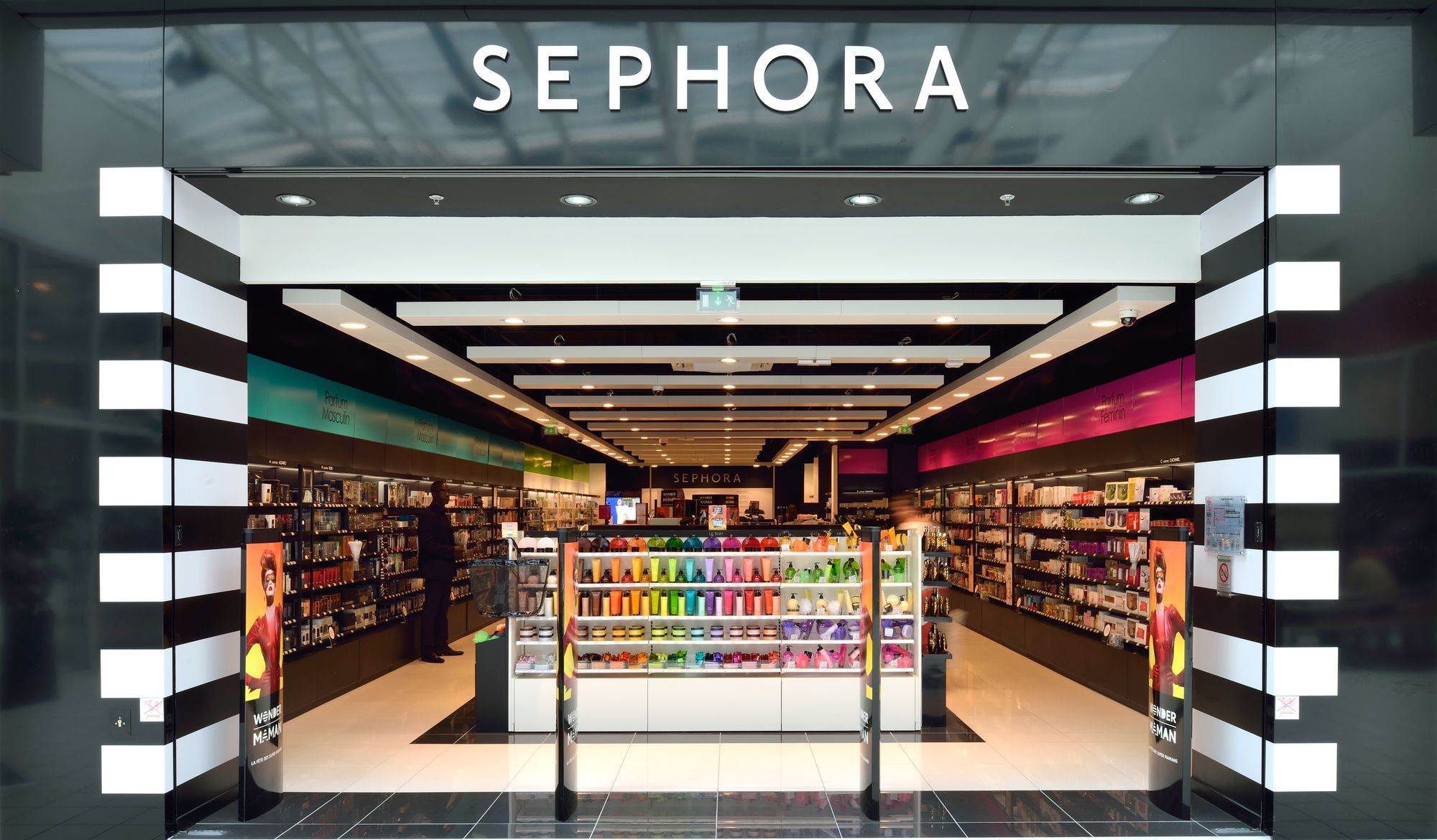
It’s important to leave room for your customers to breathe and think while they shop.
No matter how important, fast and impulsive buying is, it is a proven fact that people give some thinking when they are buying valuable items. The decompression zone in retail stores is essential to create a controlled and peaceful environment that they don’t feel in a rush.
Related: 15 Creative Retail Display Examples to Increase Foot Traffic and Sales